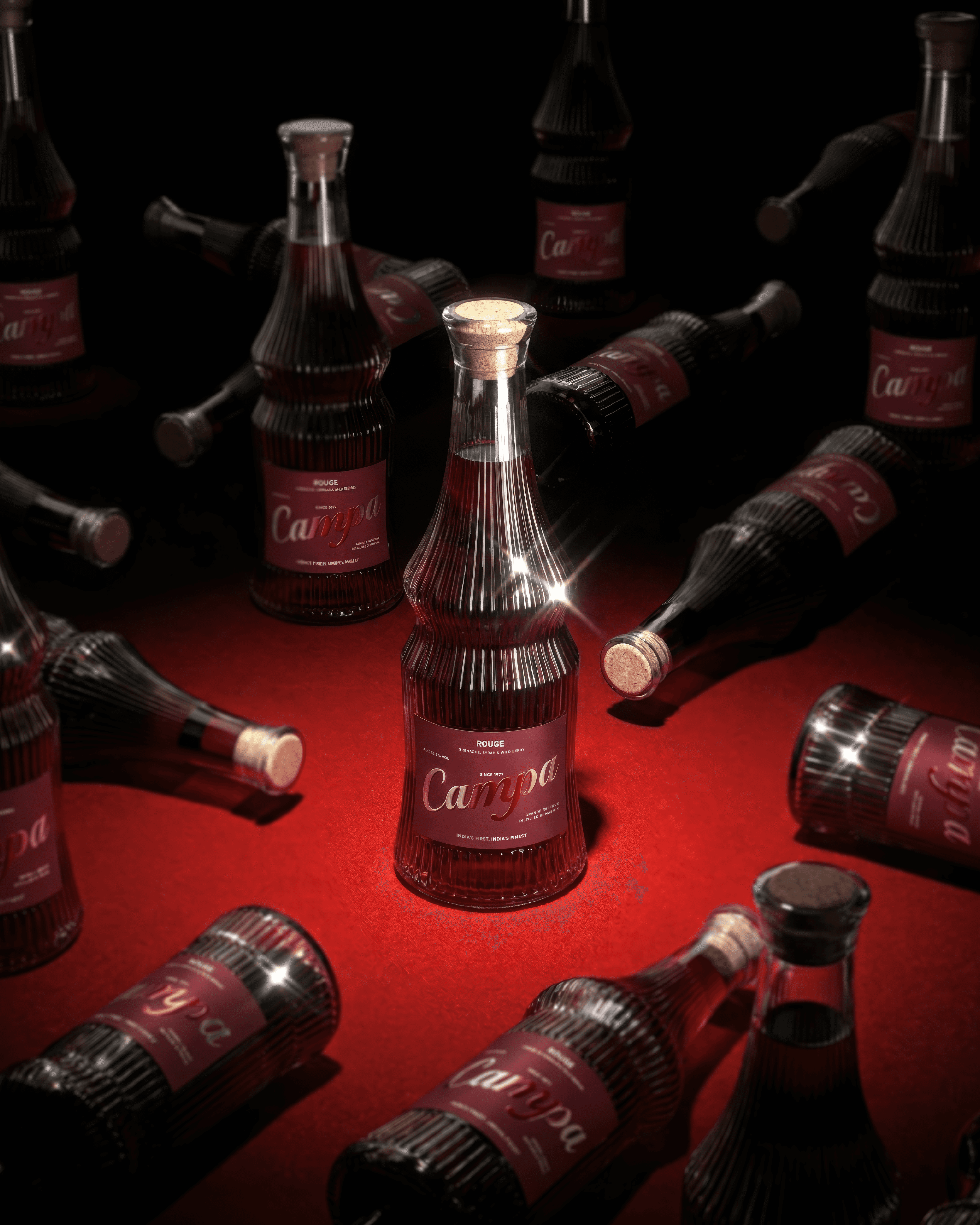
Campa
A familiar name, aged into luxury.
A self-initiated concept built on one question: what if Campa were a luxury spirit? Not a revival of what it was, but a new reading of the name as a premium, collectable alcohol brand with the restraint, craft and weight of the category’s best houses. Not affiliated with Campa.
Client
Self-initiated
Year
2026
Industry
Luxury Spirits
Turnaround time
3 Weeks

The Challenge
Campa is a name people already have opinions about. The challenge was to carry it into a category that demands the opposite of familiarity: luxury spirits, where trust is earned through craft, provenance and restraint. The brand had to feel aged rather than nostalgic, and premium without borrowing the amber-and-gold clichés of the shelf.
The Approach
The identity treats Campa as a house, not a label. A confident wordmark leads, supported by a restrained palette of deep reds and dark neutrals, with typography chosen for weight and calm rather than decoration. The packaging is built around the object itself: glass, cork and a quiet label that lets the bottle do the talking. Every decision favours patience over noise, so the brand reads as something kept, gifted and revisited.
Deliverables:
Brand identity system · Logo suite & primary mark · Color & typography system · Packaging design direction · Brand guidelines · Stationery suite